Design of a whole creation system / 2020 2 min read
Role Interaction designer & UI
Task Wireframes, Prototype & Design System
One of the clients
Tools
Following the line of solving complicated workflows and complex workspaces and dashboards, this startup came with the clear need to define a fluent workflow and build a strong UI that would help the actual user and would smooth its learning curve. The idea actually was quite similar to the common tools and maps the UX designers are familiarized with but adding the complexity that every custom tool has: dedicated features on an every-week loop with detailed specifications.
Scenario
This start-up has few but solid clients that are regularly using this platform but still not creating by themselves but it’s the in-house team who’s currently navigating through (my future designs). As a brief description: that platform aims to bring to the next level the surveys market helping the brands creating from simple questions to 3D scenarios and use it to test their products.
problem
The team was building day by day a platform based on (as usually happens) developers and market insights, which means: creating based on their needs and not on user research. That means I had to define it from scratch but considering all their know-how and feedback during the catch-ups as they still were the ones who were building surveys and not the clients.
project goal
The main goal was to define a fluent navigation inside the creation process of a 3D supermarket (basically shelves and products) considering all the technical actions and the team’s mindset and references. Create a whole design system and apply it to the raw prototypes where I was testing the navigation. And even if it is not a proper goal, To dialog with developers and send on-time all the assets they usually request last-minute 😅
my design process
There were several features I already designed for them and the design process barely changed. As a team looking for a profile like mine, the UX culture was highly considered, and (as happened before) I hadn’t to defend my method but only the budget.📈 I divided the project into 3 steps: Lo-fi Prototype + Design System + Hi-fi prototype.
1. desk research
As an approach to new interactions and patterns, I started with a Benchmark that I immediately crossed with the brief and the early owner needs. What I get from there was a defined idea of what I was going to design.
Benchmark of non-direct competitors
Cardsorting to categorize all the actions
2. Interviews & SURVEYS (& MONITORING)
As the research depends always on the timing of the client, this project planned to be done in few weeks so I had to go straight to the stakeholders where the CEO helped me organizing a couple of interviews with some old clients. What I get from there was the other platform point of view and the real user’s needs. Usually, I plan a couple of weeks to monitor the users and get meaningful insights; but this time, the users were the same team I was doing the catch-ups with, so It wasn’t a priority.
3. collaborative ideation & it contrast
All the ideation was done by my side during the early stages even before the first catch-up after building the lo-fi prototype. So I could widely say that this point would quickly jump into the next one just because the IT contrast was covered also during the first catch-ups and its validation.
4. rapid prototyping
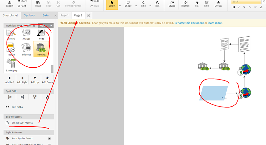
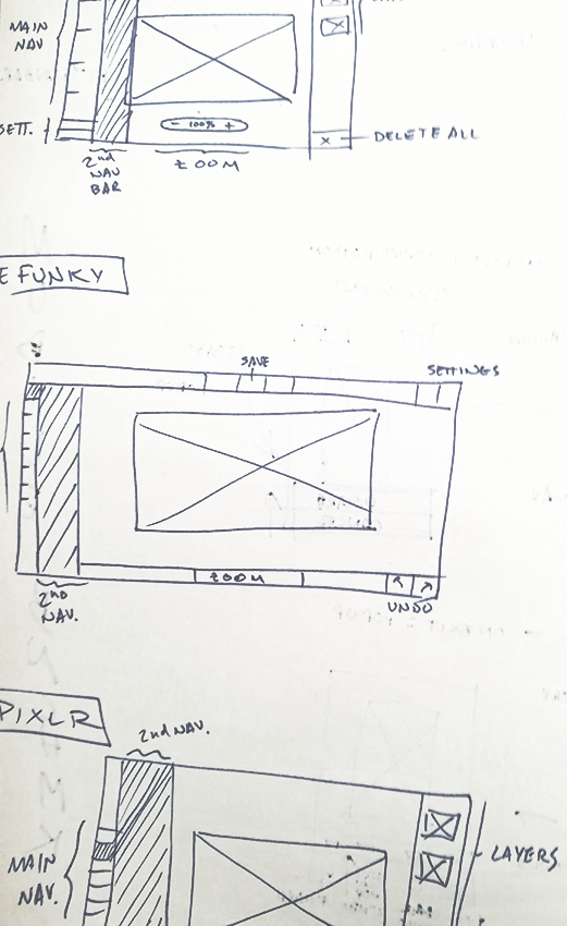
Like the rest of my projects, this part had a common name: Axure, as the tool that allows me to create interaction before design and get the best-unbiased insights at the same time. Once done, I presented it in front of the whole team (CEO, CTO, DEV) and validated it step by step. During the iteration process, the time can be pressing; fortunately, we already understood each other very well and never wasted too much time.
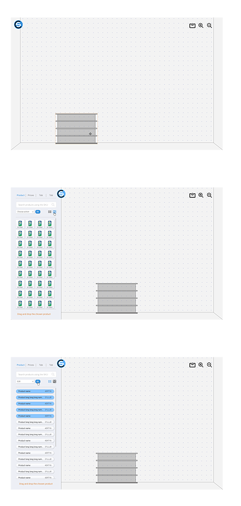
Early sketches
Click the image to navigate the actual prototype
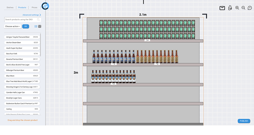
5. ui plan
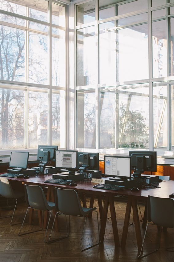
After the navigation was checked, was time to start defining the UI. At that point, I already started to design few pages to start validating some aspects ASAP: like Home and Dashboard. So my first catch-ups passed quickly as ever before. After that, I continued gathering all the buttons and assets I used to create the first few pages to define what was being born as the Design System. The work after that was easy. The assets were based on Atomic design and I continued creating very easily and scalably. The tool I used, in this case, was Figma for 3 reasons: First I work with Win10, Second my client was working with Win10, and Third but not least, it’s the best collaborative UI tool 👊
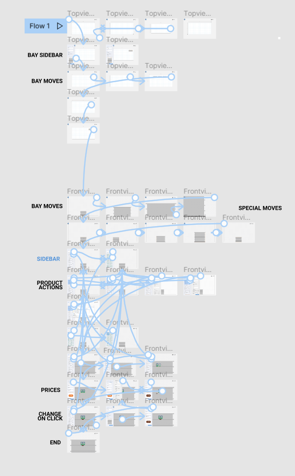
Click the images to navigate the actual prototype
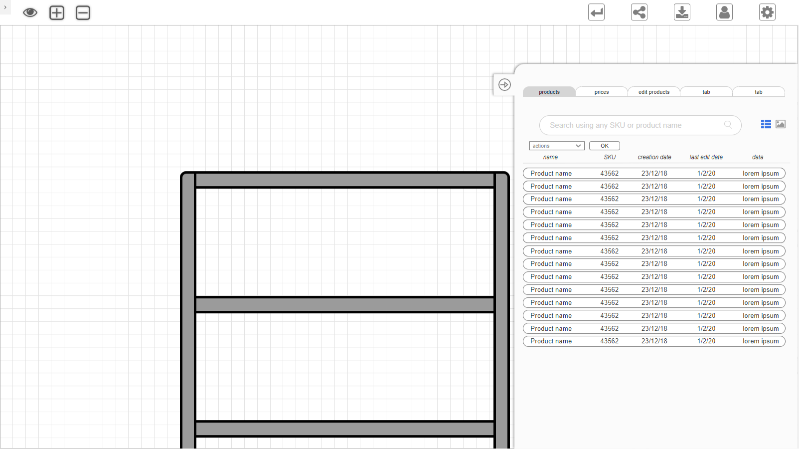
Final prototype navigation
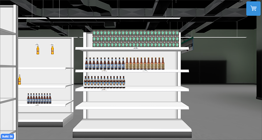
6. development plan
For the developers what I got was a whole Design System to consult and improve as much as they want, with guides and best practices to follow (or not). I also delivered a Hi-Fi prototype to consult every single distance, color, layout, and the entire library of components. They already had the Lo-Fi prototype (Axure) as a reference for the whole navigation because Figma (as Sketch or Invision) has limitations to show it properly (in my opinion, of course). After delivered, my follow-up was to continue meeting the developer and assisting him during some assets petitions (as the f💀%$🕷️ icons and SVG can not ever be properly exported!!)
Hey there I'm Adrian Ortinez!
A User-Centered designer with a data-driven mindset, focused on iterating an idea until it’s sharp, AKA a natural inclination for always thinking MVP first.
I am specialized in solving complex systems of workflows for SaaS products and B2B companies.