Reshape a creation flow for analytic dashboards / 2019 2 min read
Role UX designer & Researcher
Task Research, Prototype, User testing & UI
One of the clients
Tools
Scenario
During my early days as a freelancer, a top Startup reached me to redefine their dashboards and some other satellite processes. The field was the Analytics between a user and the Streaming or Video On Demand (VoD) service as its source. And checking the funnel there were some thousands of dashboards that clients (from Chiefs to Engineers) were creating and revisiting every single day. Many people, lots of types of usage.
problem
Here I could just talk about the design to solve or expose the issues found as a freelance consultant, and that’s what I’d like to share among the typical journey and workflow. The company was redesigning its platform as some months later there was a huge event were to present new features, so not much time from one side. Furthermore, there was not much historical user data nor any other data where to base my methodologies. Something bothering me was that the prototypes had to be pixel perfect😪
project goal
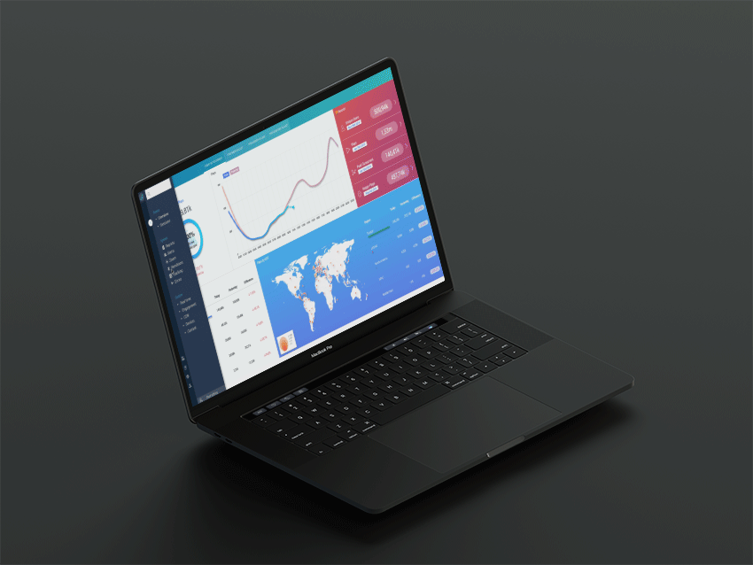
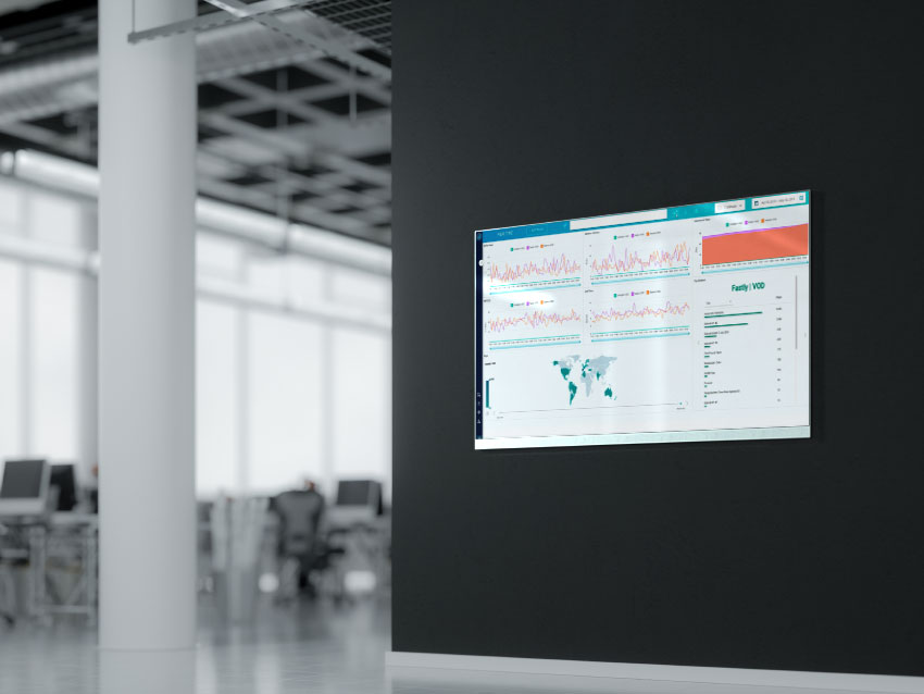
In two months’ time, my goal was to redefine the main dashboard and its processes. Also, a few more interactions appeared in my way. But in this read I’ll report only the main feature: Redesign a Real-Time video analytics SaaS -from Home to Dashboard-, including two levels of menus and all its aside flows.
my design process
1. desk research
There was a great-great-great Design System already created by my predecessor, a perfectly defined work of assets and elements that helped me the most during this countdown project. 60 days in total. So, what I did the first was to soak up the UI and the platform navigation, make a list of references and competitors, and benchmark a lot. That took a bit more than a week, plus a couple of days, in the beginning, to understand the environment, knowing the people, etc.. I had 50 days left. 🏃♂️
2. Interviews
As there was no historical data of the platform usage, I started with some interviews in-house as I couldn’t do it to the clients due to some kind of confidentiality with some of them, plus the more than common lack of time. That was a huge startup, so I had many types of profiles that I could ask: from marketers to engineers or Q&A, 24h support or even chiefs; a great catwalk of professionals to investigate thoroughly. Mmm.. about 45 days left at this point.
3. MEthods
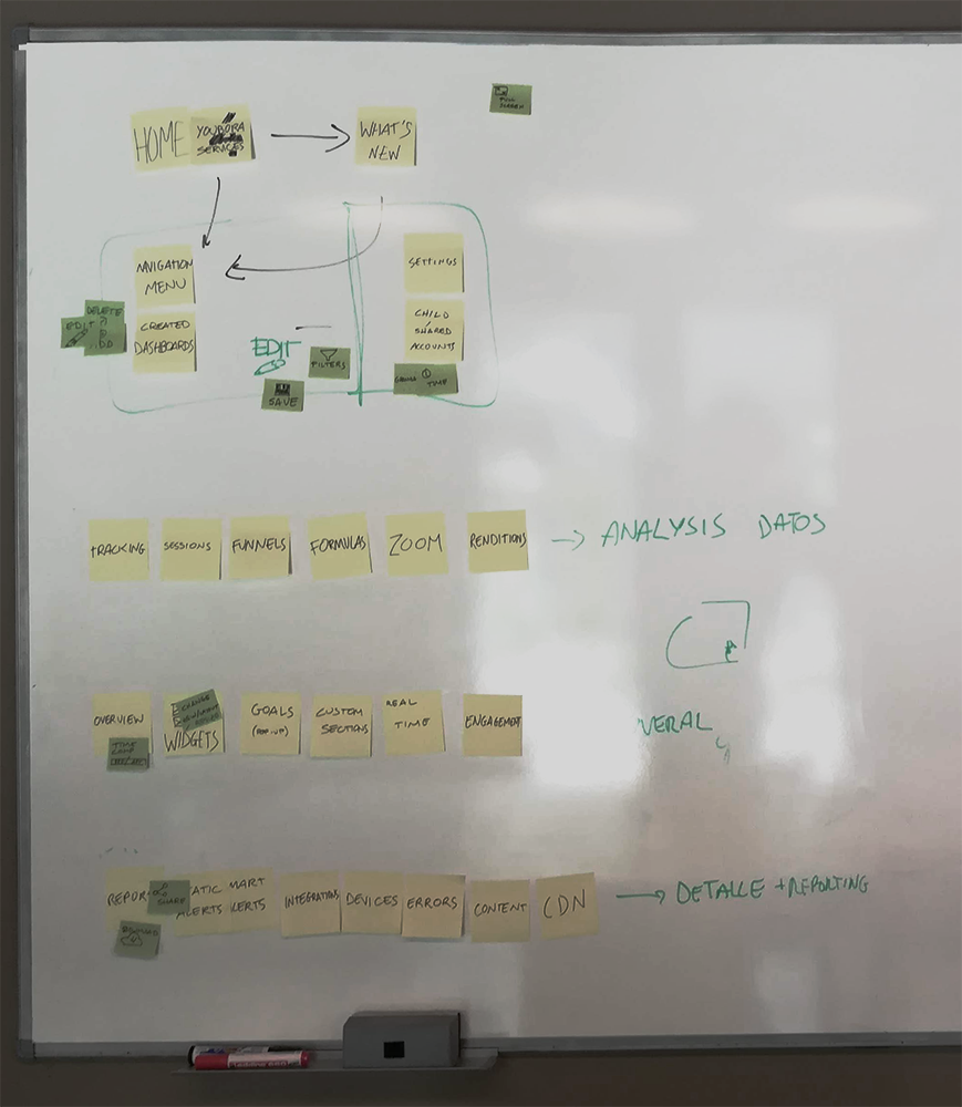
Other methods that I considered important to apply due to my goals and the resources I had, were: Card Sorting and Flowchart Diagrams.
4. collaborative ideation & it contrast
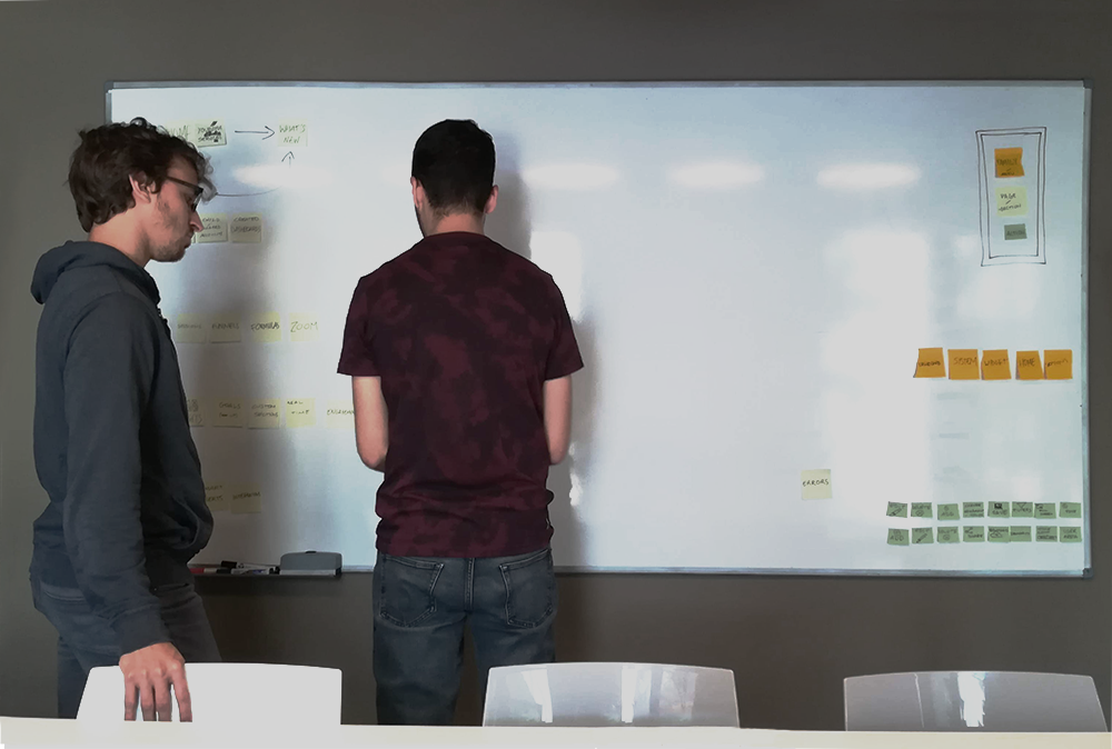
Other profiles involved in the project were two POs and one React Developer as the platform was being rebuilt (the main reason I was there) in that language. The main PO lead the project and let the secondary PO work side by side on each feature with the developer, both profiles had very different mindsets, a situation that a fresh mind like mine helped to merge and push forward. The last but not least ingredient needed for a perfect redesign. 🎩
5. rapid prototyping
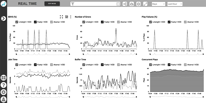
At this point I proposed my own tools, which means Axure, the best rapid prototyping tool to validate the layout and navigation all at once, being able to also test it avoiding UI distractions. Aaaand, here came the conflict, because the CEO demanded pixel perfect, but as the other co-founder allowed me to purchase the license, I kept my workflow safe. ✌️
However, I couldn’t avoid the eternal loop and that wasted some extra time. Less than a month left. On that prototype, I included some game-changing proposals, like the two views menu: edit/view as the Dashboard creation process was very messy with no option to easily create/delete/reorder.
Click to navigate the actual prototype
6. USER TESTING
A very good and quick way to test it was to pick different profiles in-house and make a guided user test. So we picked someone in Marketing, a Front-end and a Back-end developer, someone in QA, a Content Creator and a PM, and one by one during a couple of days we guided them using some tasks, related or not with their position.
I had to book and manage several agendas, not an easy job to do in one week, so it took 2. 🤷♀️ Only 15d left.
7. ui plan
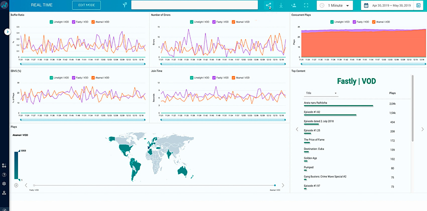
As I said before, the whole design system had been defined and accurately done by a great UI designer in Invision, so my contribution at that point was to recreate the wireframes with all the assets and make a full navigable pixel-perfect prototype to definitely validate the project with all the Chiefs in charge.
Running out of time at this point but almost on point. Final sprint. One week to go!
Final-pixel-perfect screen
8. development plan
As happens sometimes, there’s a great guy who wants to do more (or just quicker and before anyone else). In our case, the front-end dev leading this project started to prototype a bit in React (the chosen code for the new platform), what allowed us to see how to apply some existing libraries and see possible issues it could have with the Data viz assets. From that point onwards, I was almost out and I started the handover with my fleeting colleagues. The countdown had run out and I nailed the project. 🏁 Sweating but with a big smile.
A project that I enjoyed a lot in a rare but, in my opinion, very win-win format. A startup could have no need to hire an expert (doesn’t matter the field), just being able to hire them as consultants for specific projects. All clear, with all the options on the table. Take it or leave it.
Hey there I'm Adrian Ortinez!
A User-Centered designer with a data-driven mindset, focused on iterating an idea until it’s sharp, AKA a natural inclination for always thinking MVP first.
I am specialized in solving complex systems of workflows for SaaS products and B2B companies.


")
")