A whole ecosystem: APP, web design & Purchase funnel / 2016 3 min read
Role User Researcher & Interaction designer
Task Research, Wireframes & Prototype
The client
Tools
This project belongs to the naïve group of “the uni projects” as it’s the ideal scenario that never happens as it has both research and seller parts, so you are working for a client that wants you to research using all the existing methods and pays you for delivering those results and prototype and design them. In my experience, the first part happens only if you are working in an innovative branch and the second is more common, but although usually mixed, never stirred 🍸
It can seem a common and unreal master’s project but read until the end, it has a twist 😉
Scenario
During the Master’s degree in Usability and User Experience that I attended a few years ago (2016), I had to elaborate, with other 3 students a whole reshape of a digital ecosystem for a Theme Park. The main theme park in Barcelona: Tibidabo. We had 6 months to do it and as I already said, we had to include, all the existing methods that we were learning on the go.
problem
The brief from the teachers (from now on the client) was asked on one side, to rebuild the website and its ticket purchase funnel and on the other side, to create a whole App from scratch. But we did much more!
project goal
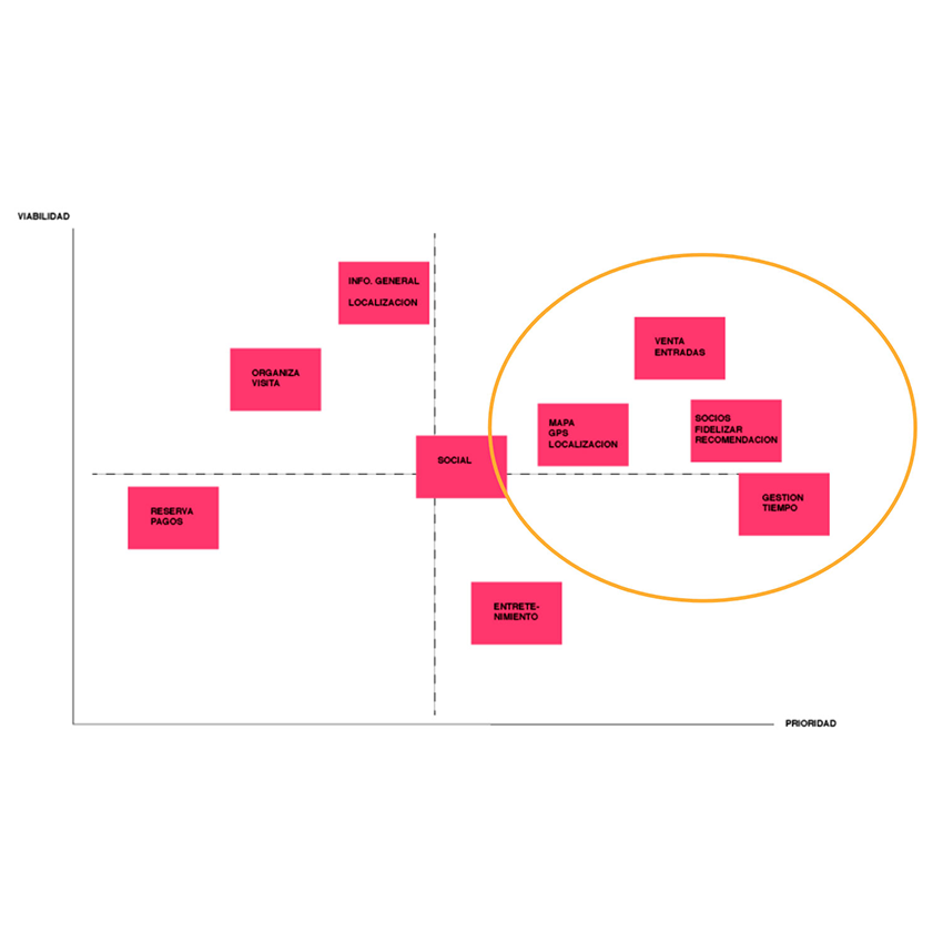
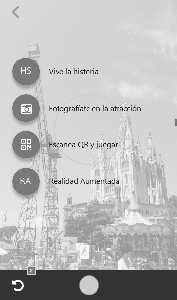
Our main concern was to englobe all the digital and offline park experience, as during the research we saw that other theme parks were slightly doing. We were going to spend much more time on the app and the research than on the website and the purchase funnel. Something that I really appreciated from this project is the de-digitalization of the industry. The physical experience was the main attraction but the goal of the digitalization with the IoT options and more, was exciting. Well, we were going to blend it like pros.
my design process
1. desk research
We started from simple brainstorming, bringing ideas, to an amusing project as a Theme Park. We used ‘the crazy 8s’ to unleash our potential and shyness 💪. Finally, we did a small card sorting between us and some guests to categorize the ideas and apply them in the User journey. Then we continued and divided work to do a Benchmark as big as possible, from both direct and indirect competitors, like music festivals or similar companies with similar crowd managements. In addition, we did an extensive competitive analysis based on the top Theme Parks around the globe and their leading digital experiences.
2. Interviews & surveys
That happened in the field, as it has to be, at least the qualitative methods. We went to the park to watch, map areas, and ask, interviewing the clients in the cues: the main pain point the client highlighted. I forgot to mention that first, we get tickets for free as experts, of course 👩🔬
We also sent a massive survey based on Google Forms, that received lots of answers (maybe because we all love Theme parks, and maybe because we all thought that TIBIDABO needed an in-depth cleaning 🤡)
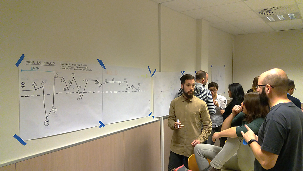
3. UX methods
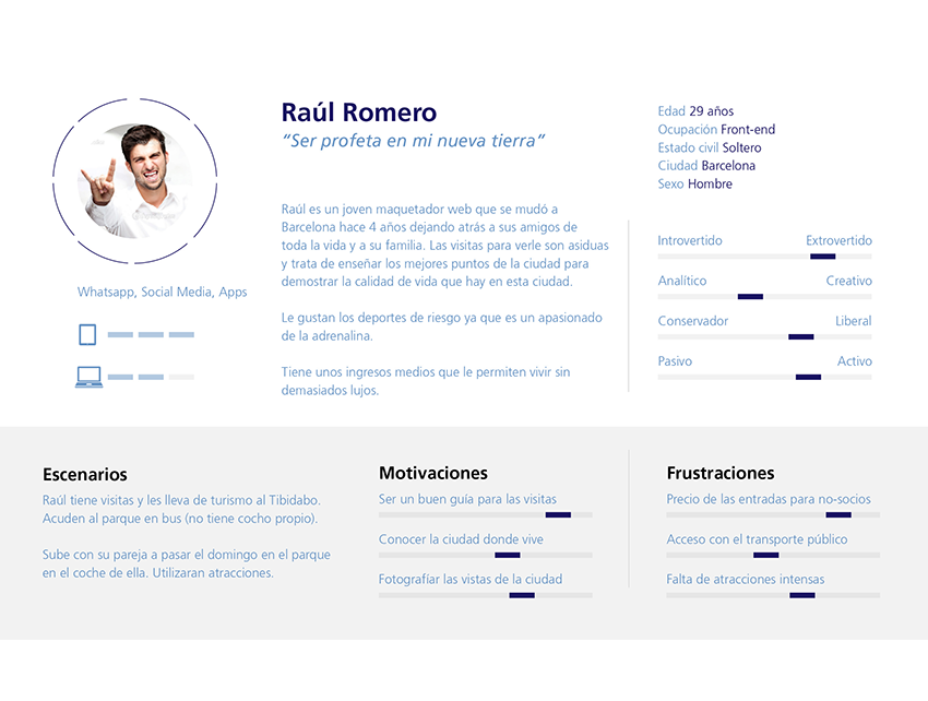
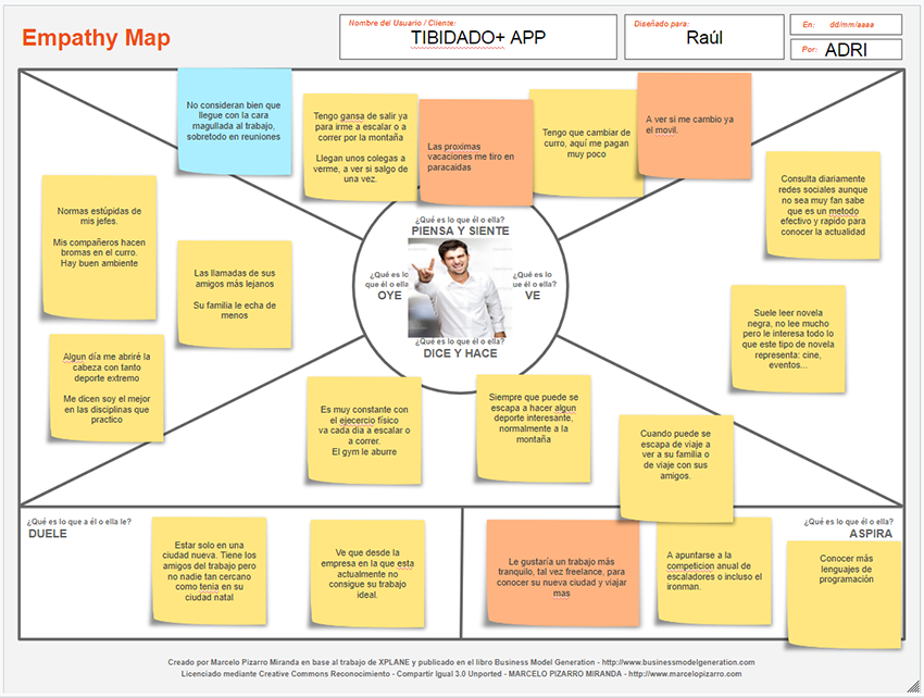
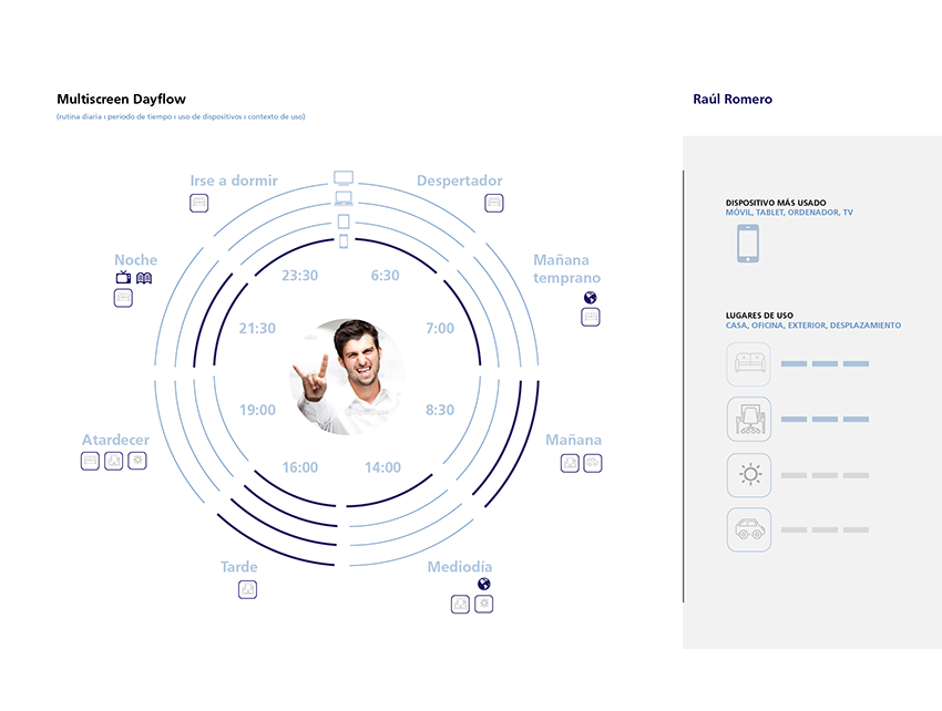
With all the gathered data we started applying methods to really connect with the user, from Personas, to its Scenarios, Empathy maps and their Customer Journey maps. Our approach at that point was so close and we were already solving big issues, we were setting out really significant measures.
3. AI & rapid prototyping
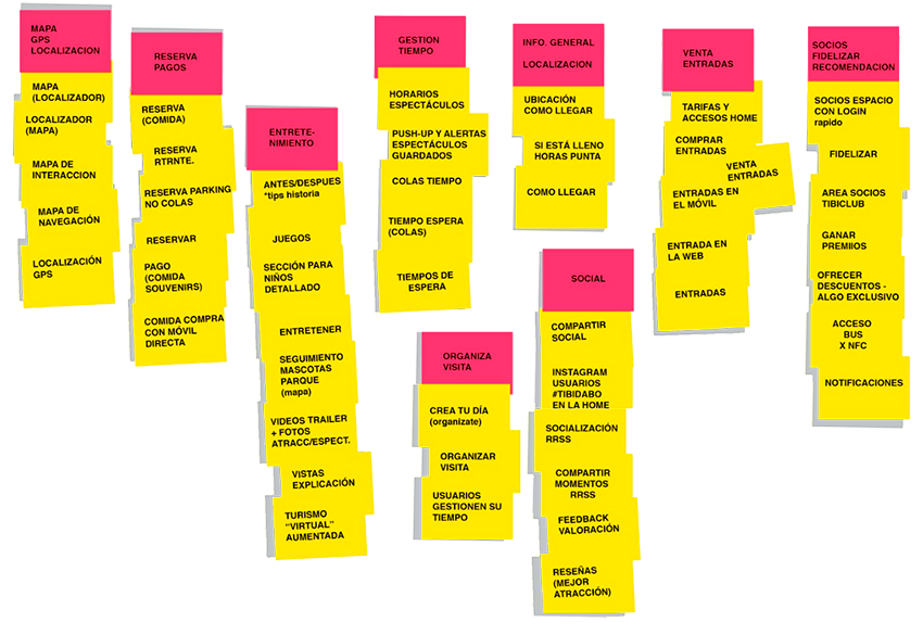
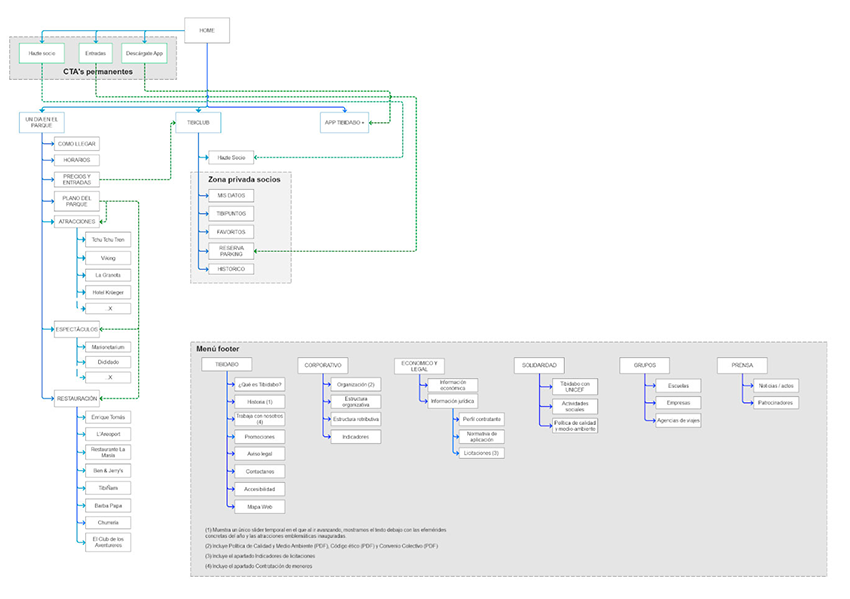
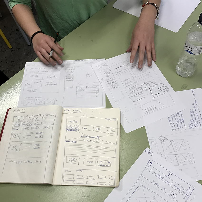
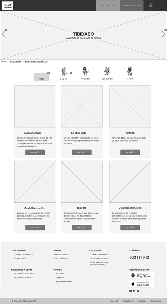
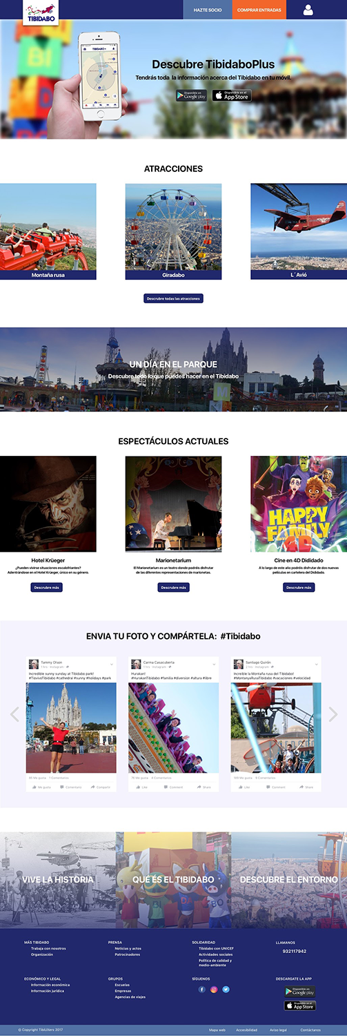
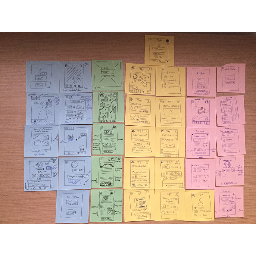
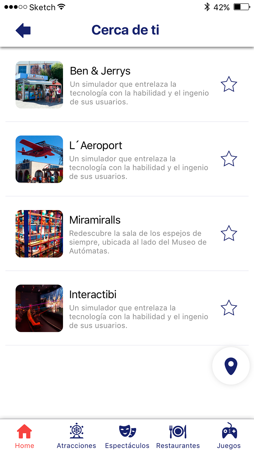
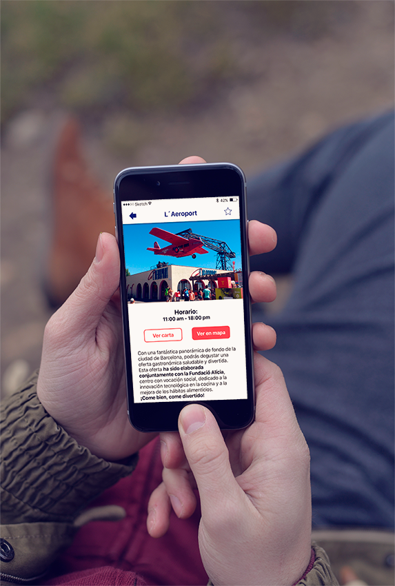
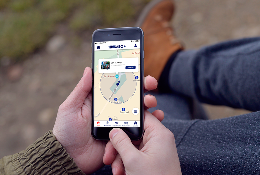
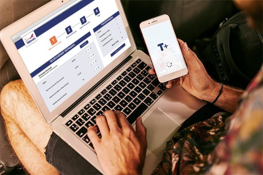
Once the research was done the structure was just starting. Our job was now to shape the purchase funnel and create an app with amazing proposals to, among other things, improve the waiting massive pain point. We started sketching like crazy, iterating ideas between us and connecting thousands of dots. Then we did another Card Sorting to categorize the main parts and navigation and finally we set it up on our User Flow and the Flowchart, diagram. Finally, we transformed the sketches into wireframes and we started to set all the interactions using Axure RP, the best tool to do that. As an add-on even if it was not necessary (in the brief) but as an exercise, we did the Service Blueprint and reshaped a bit the Service Design.
Click the image to navigate the actual prototype
Mobile design process
Click the image to navigate the prototype
4. ui plan
After validating it with the client, we were ready to start the UI, so we did. All the screens were ready after a few days. Everything was already in our heads. Of course, we started by defining the Style Guide, with the Design System approach, as being a big company was easy to be needed. Finally, once all the screens were done, all of them connected, and every single detail documented, we planned our successful presentation of the project. A great team for an amazing project. And finally! as promised, the plot twist! after a few months, the TIBIDABO website was looking as our final UI. 🎡 Just check and judge yourself → tibidabo.cat
I could be millionaire at this point, but no hard feelings guys!
Posted by:adzen_mi3qoc
Hey there I'm Adrian Ortinez!
A User-Centered designer with a data-driven mindset, focused on iterating an idea until it’s sharp, AKA a natural inclination for always thinking MVP first.
I am specialized in solving complex systems of workflows for SaaS products and B2B companies.


")
")