SUMMARY
NEOM, through FTI Delta Partners engaged me as a Data Visualization and Usability Expert.
The project focused on designing a dashboard for NEOM’s Economic Ministry executive board.

YEAR

2022

ROLE

Data visualization and usability specialist

CONTRIBUTION

data viz · interaction designer · usability

TOOLS

figma · power bI

THE GOAL
The goal was to first design and after develop in Power BI an intuitive interface for monitoring estimated budgets during the construction of the ambitious Saudi project.
the challange

The primary challenges were twofold:

1. Provide the executive economic board with a quick, comprehensive overview of the current budget to facilitate rapid decision-making.


2. Create seamless navigation across all modules and define data representation within each page, while working within the constraints of Power BI’s limited design library.

the PROCESS

Given the pre-defined stakeholder requirements and consistent data flow, extensive user research was not necessary.

The design process unfolded in several stages: :

  • Review and definition of each data source

  • Selection of appropriate charts or stats for the four main modules

  • Creation of a general Quadrant page summarizing the modules

  • Development of a simplified Overview page with interactive alerts for immediate action

  • Wireframing of each page

  • Definition of a Style Guide

  • Application of UI design to create a fully interactive prototype
Provided data and reference graphs at the beginning of the project (Blurred senstive data) 

Key design decisions included:

  • Simplifying large tables into interactive charts, such as the table plus horizontal charts and scatter plot switch section
  • Creating an Overview page with traffic light indicators and interactive tabs for critical alerts
the outcome

Key features included:

  • Simplified data representation, transforming complex Excel sheets into intuitive charts.

  • An Overview page allowing board members to quickly identify areas of immediate attention.

  • Improved usability in chart interactions and inter-page navigation

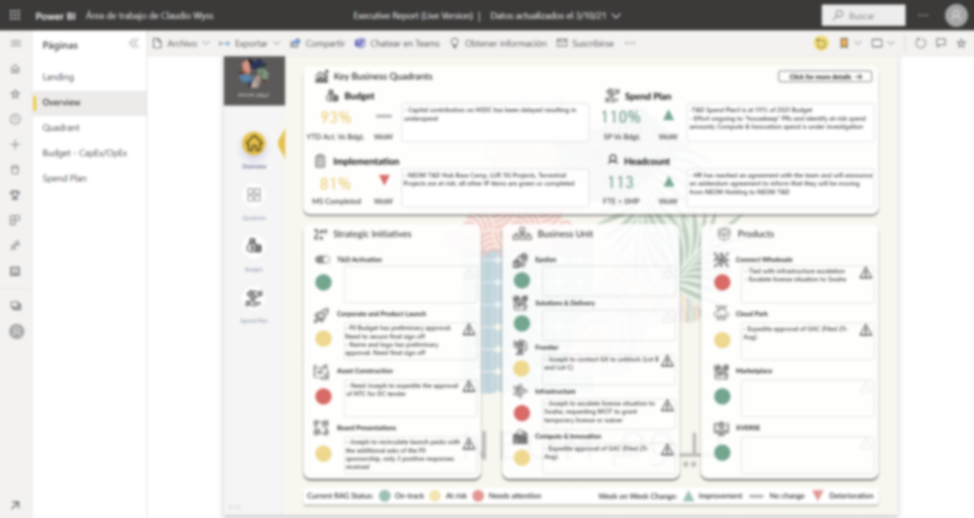
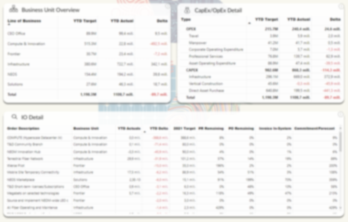
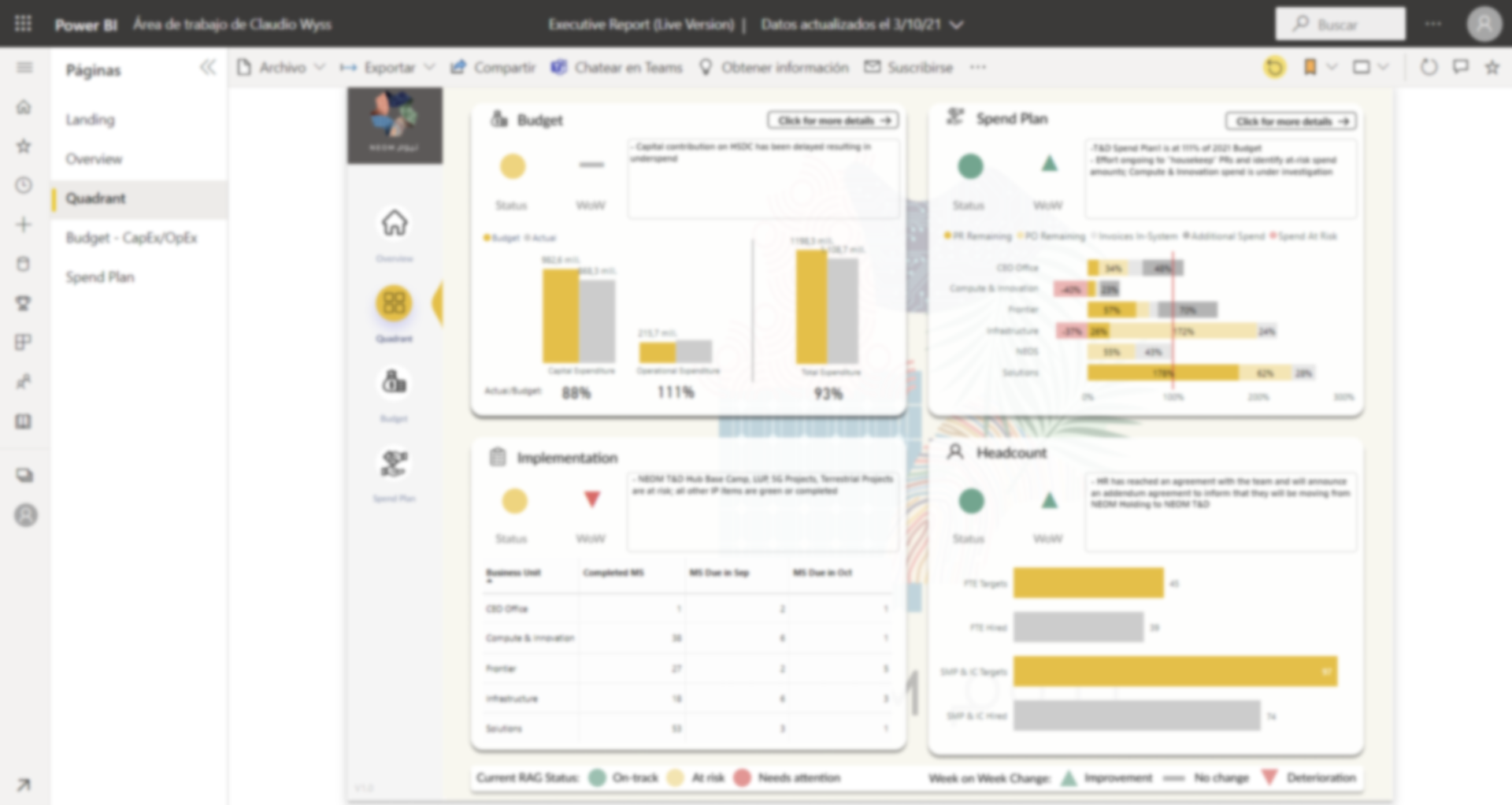
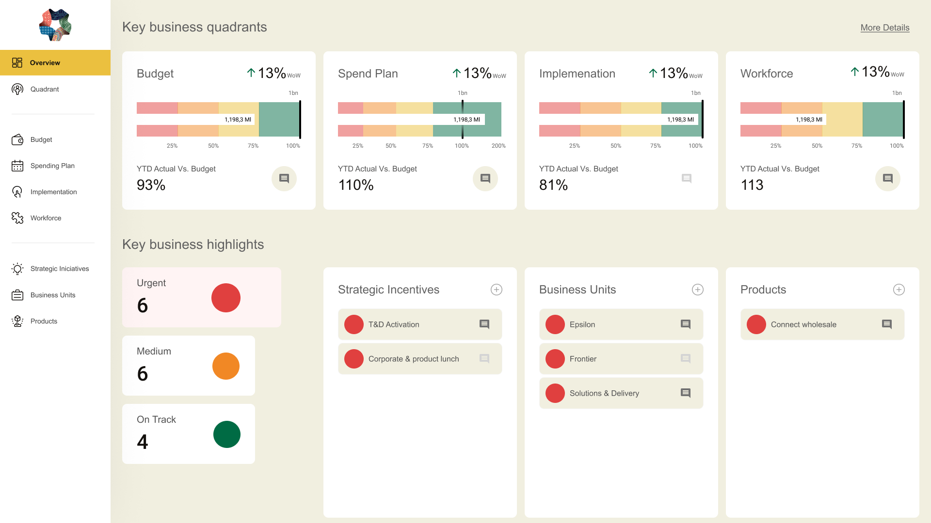
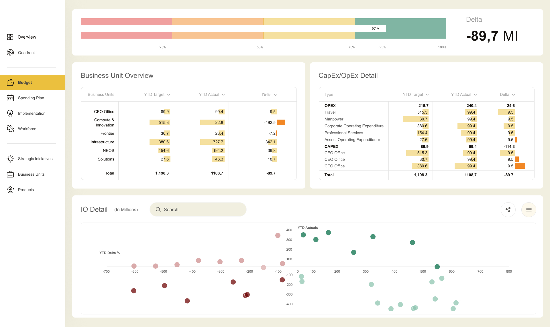
This project underscored the challenges inherent in data visualization, particularly in balancing the need to display large amounts of data while maintaining interactivity and aesthetic appeal.

It highlighted the importance of simplification and user-centric design in creating effective B2B interfaces, especially when dealing with complex financial data.

©2024, adrian ortinez design