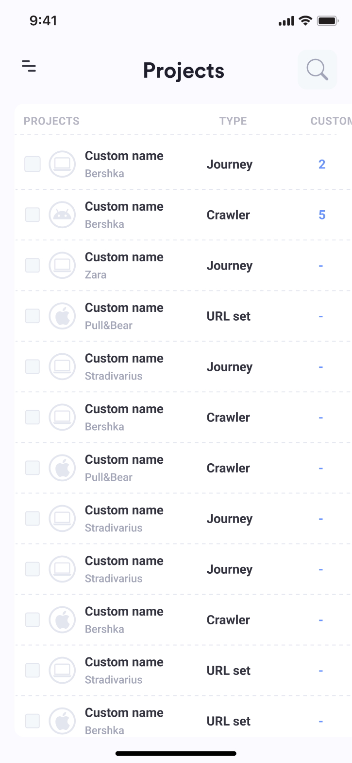
Some screens are simplified or omitted.
01 · Frame
Reliable data, one audit at a time
Datail automates the debugging of Google Analytics 4, Firebase, Adobe Analytics and any other tag, across websites and iOS and Android apps, and helps teams stay GDPR-compliant.
The problem. The MVP was so hard to navigate that Datail's team built every audit by hand for its clients. The product couldn't scale beyond the people running it.
The users. Data analysts and SEO managers at Inditex brands such as Zara, Bershka, Pull&Bear and Stradivarius.
The goal. Hand audit creation over to the clients, so they could create, edit and follow up their own integrations with third-party analytics tools.
The mandate. Brought in to improve the MVP's usability, working with the CEO and founder and with Datail's in-house developers.
02 · Discover
Where the MVP broke
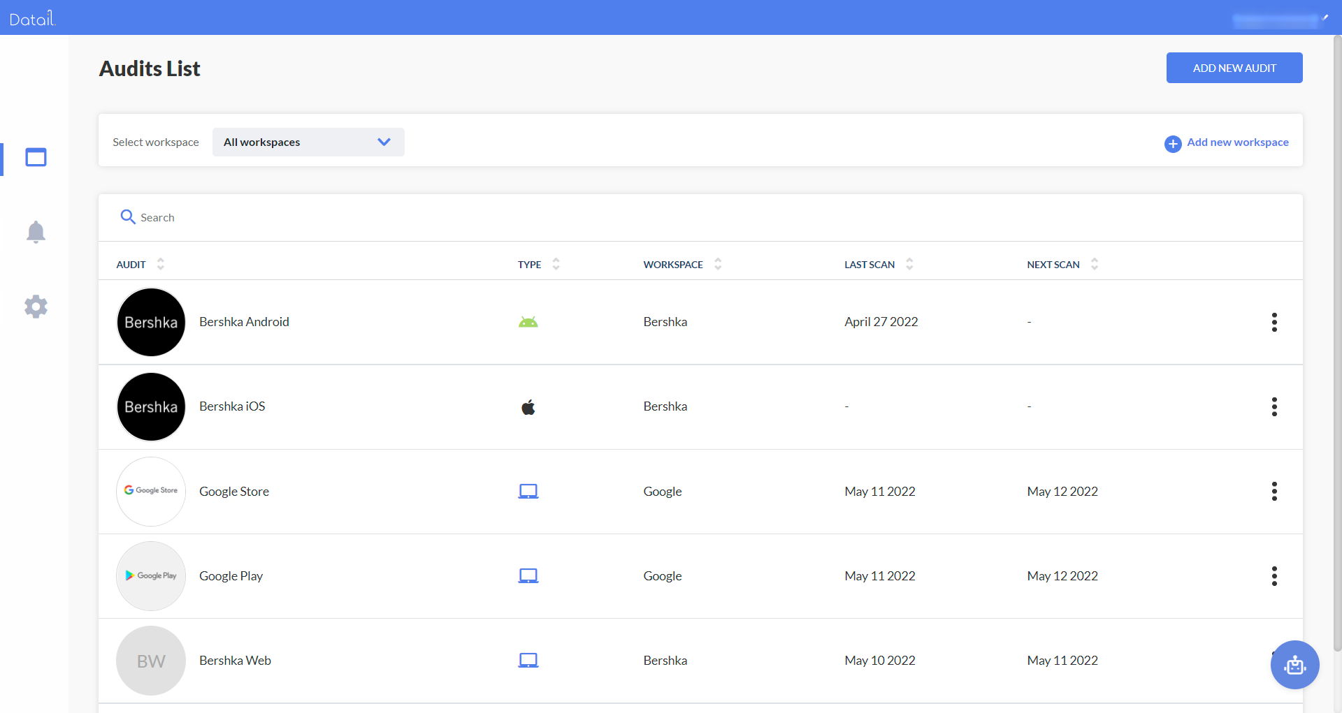
I read all of Datail's product and business documentation, then mapped every MVP screen into a single screen-flow diagram in Figma and re-categorized it.
What we found. The architecture was hard to follow even for technical users. Creating a detailed audit, and following its performance afterwards, was close to impossible without help. Everything started inside an audit: the site or app, the scan method, the schedule. Rules were buried inside alerts.
The call. The navigation couldn't be fixed, only rebuilt. The usability brief became a new architecture.
03 · Define
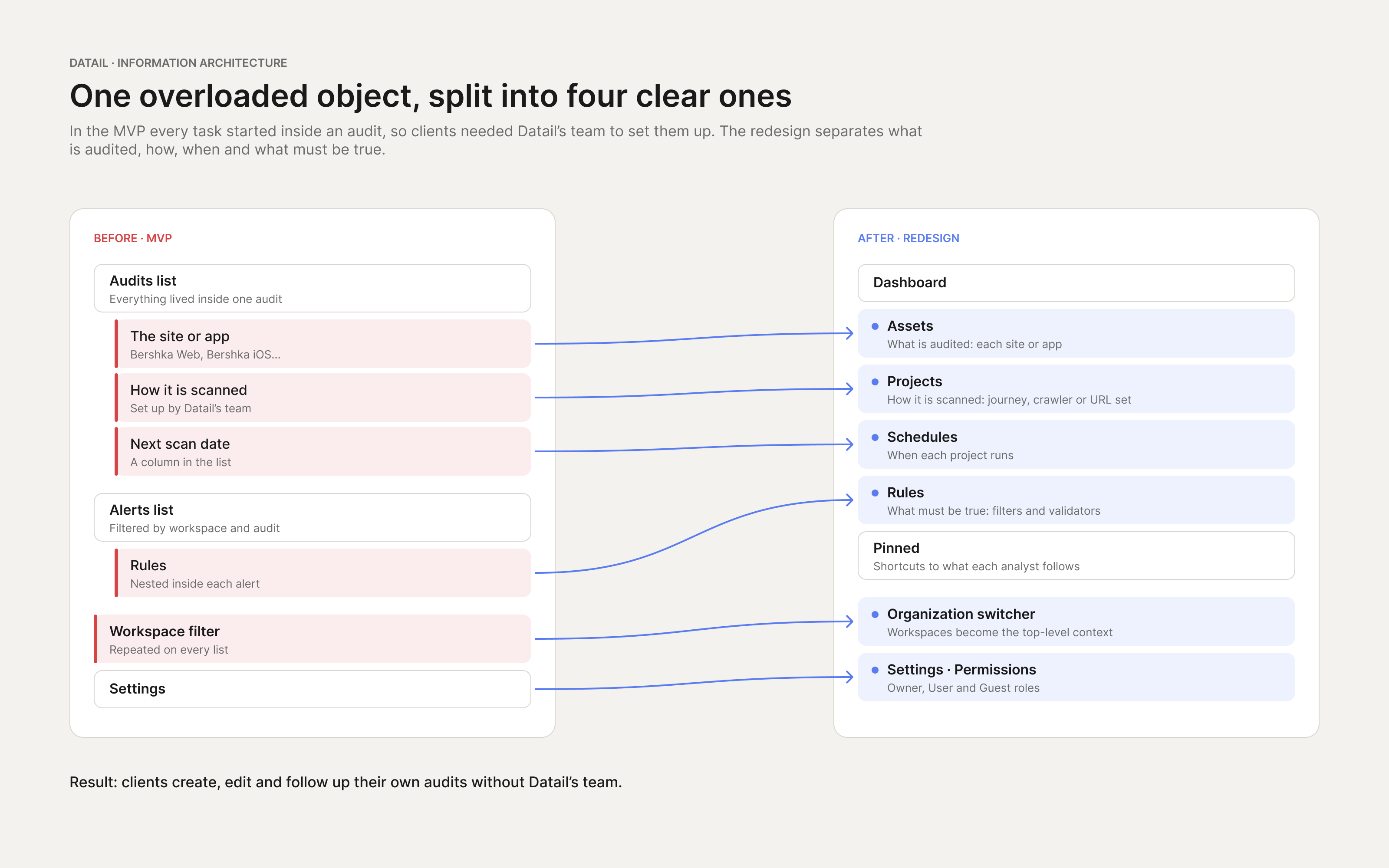
One overloaded object, four clear ones
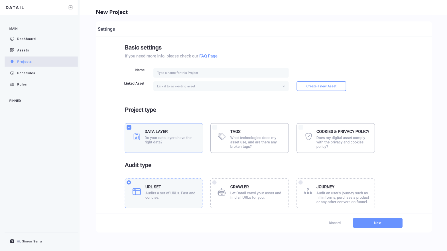
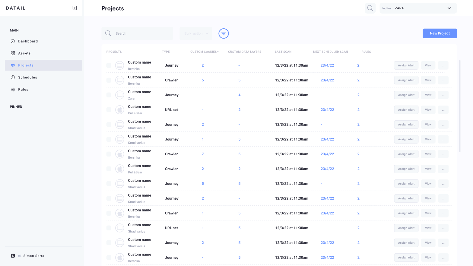
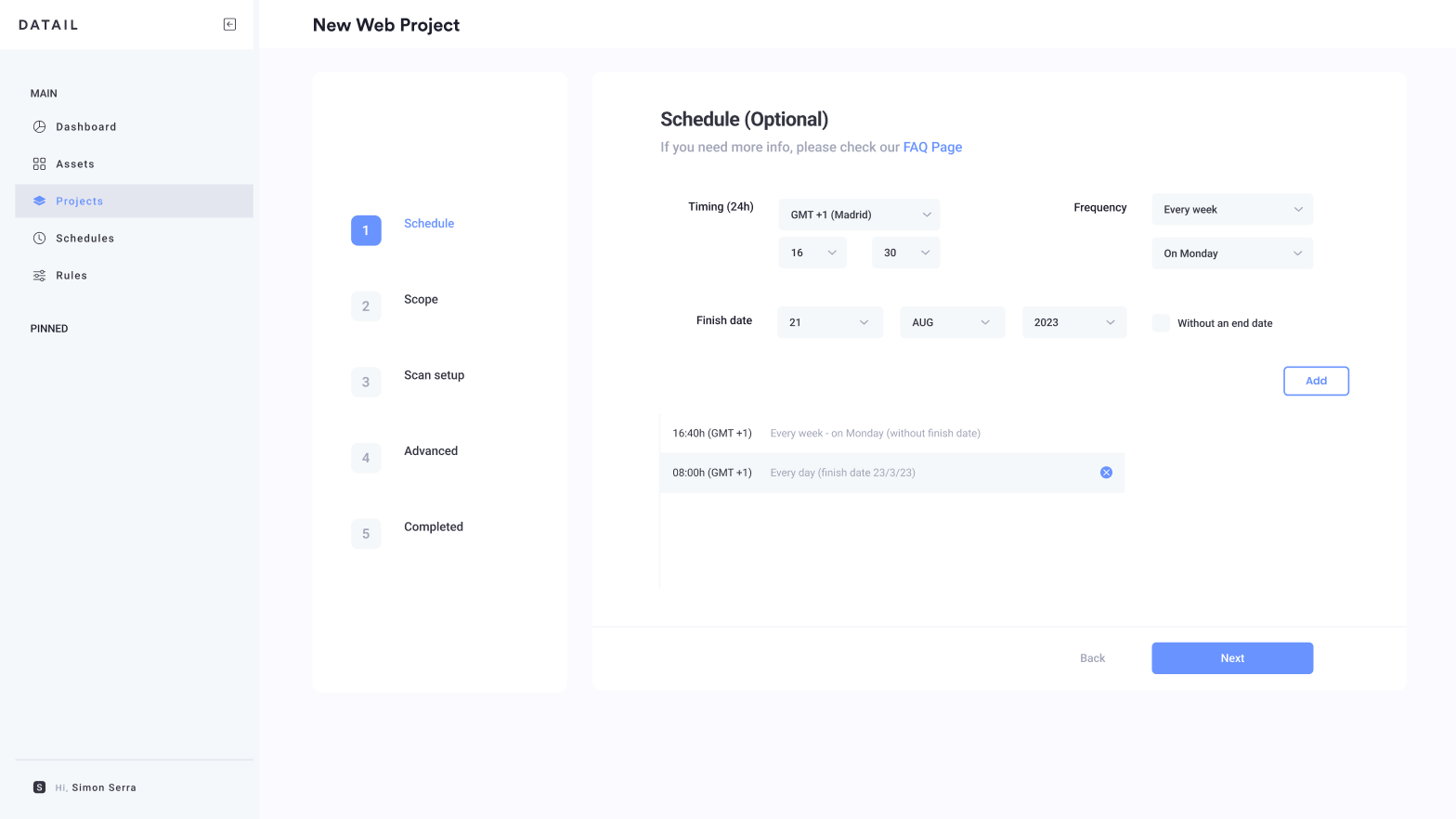
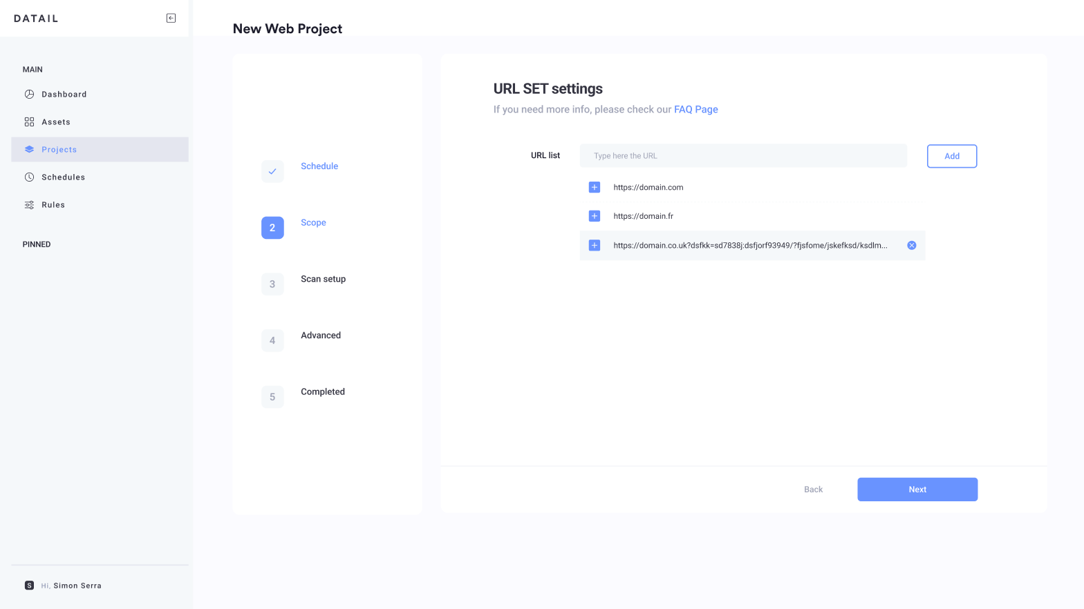
The architecture. I split the audit into four objects, each with one job. Assets: what is audited. Projects: how it's scanned, by journey, crawler or URL set. Schedules: when it runs. Rules: what must be true.
The navigation. Main actions, creation levels and folders ranked in one sidebar, with pinned items for what each analyst follows. Workspaces became an organization switcher instead of a filter repeated on every list.
Permissions. Owner, User and Guest roles, so each client could invite their team and keep control.
Priorities. The creation flows, because they decided whether clients could work without Datail's team.
 Open full size ↗
04 · Prototype & validate
From wireframes to a full system
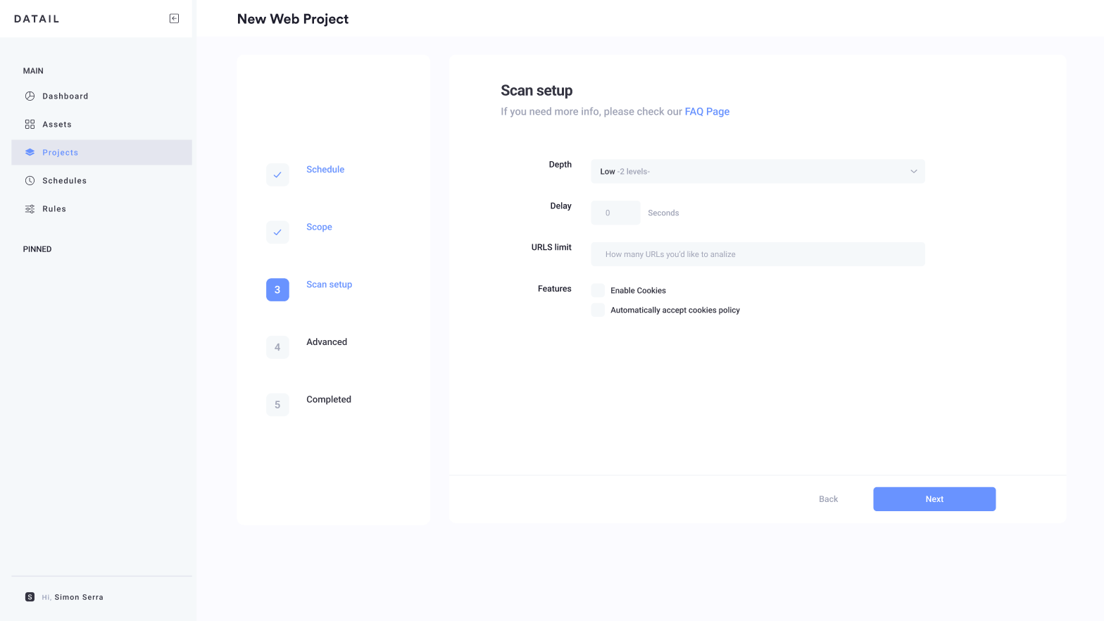
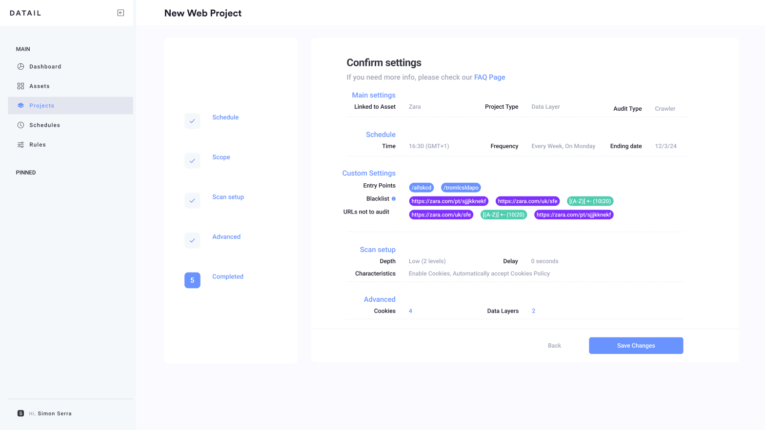
Creation flows. Step-by-step wizards for projects (schedule, scope) and rules (main settings, filters, validators), plus a journey recorder to capture user flows on web and apps.
Brand and design system. I designed Datail's logo, visual identity and website, and a design system that carried it across every screen.
Every surface. A fully interactive prototype for desktop, tablet and mobile.
Status: shipped to production, built by Datail's in-house developers with my follow-up.
05 · Deliver & measure
Auditing where developers already work
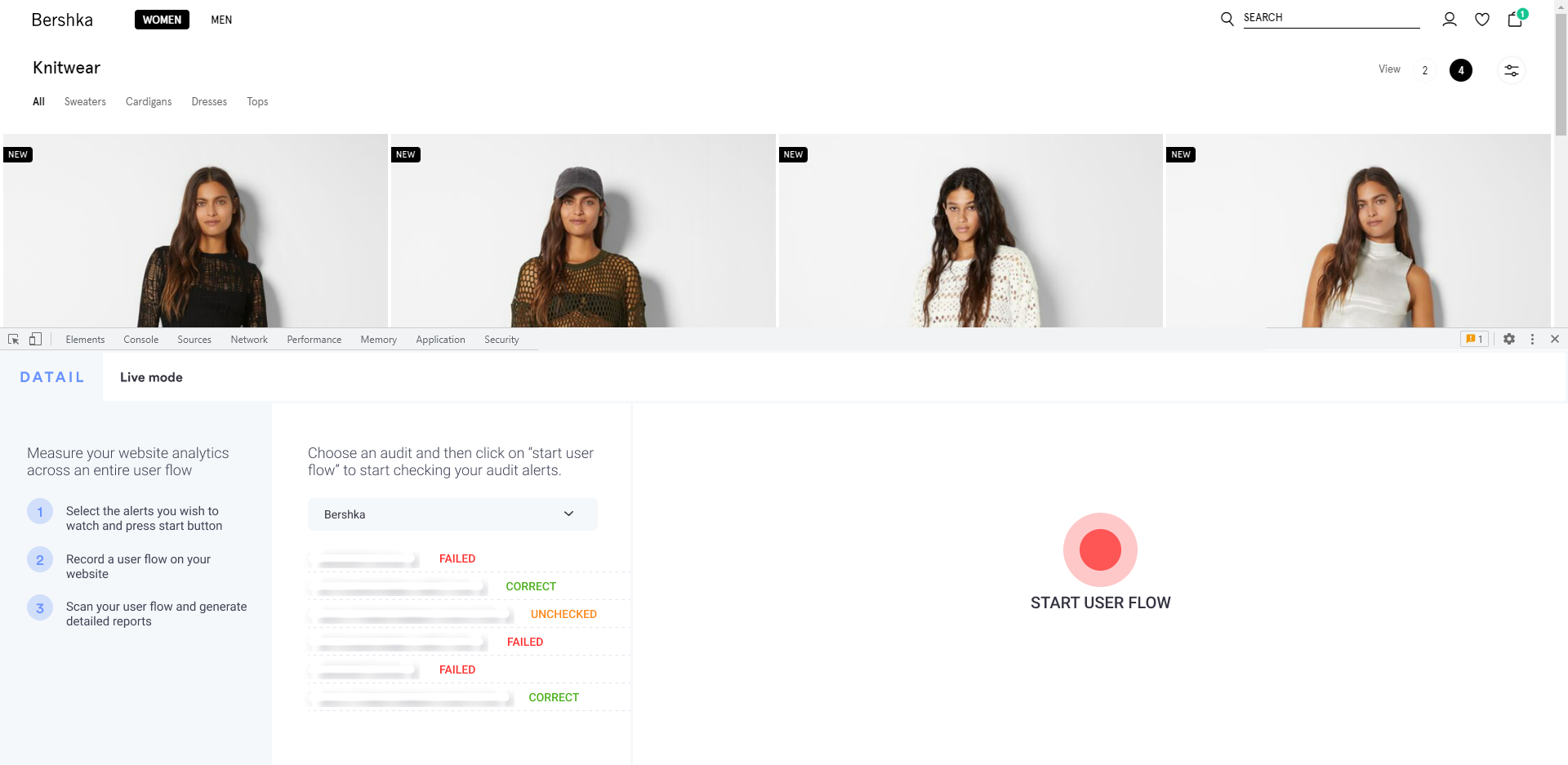
The developer plugin. Automated scans can't reach every path: checkouts, logged-in areas, multi-step journeys. So Datail also lives inside Chrome's inspector. A developer picks the alerts to watch, records a real user flow on the live site and sees each tag marked as failed, correct or unchecked, page by page, right where they'll fix it.
The impact. Clients gained the autonomy to create, edit and follow up their own audits and integrations, instead of relying on Datail's team for every setup.
What I decided. To rebuild instead of patch, to split one overloaded object into four, and to take auditing into the developer's own tools.