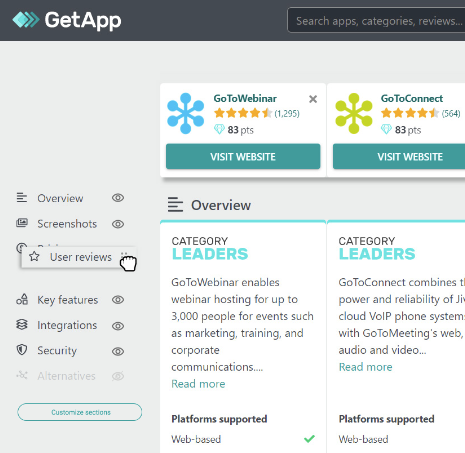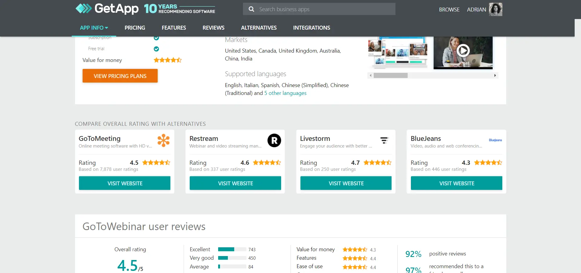
Data shown is fictional. Real client data and some screens are omitted due to NDA restrictions.
Context
Lots of visitors, few returns
New users were flocking to GetApp, but far too few came back.
The users. Non-tech-savvy people searching for the right software, relying heavily on reviews and careful comparisons.
The problem. Unclear category structures and confusing interactions were undermining that experience.
The goal. Boost engagement and performance through thoughtful microinteractions.
01 · Deliverable
A quantitative foundation
Hotjar heatmaps and Google Analytics data showed where users clicked, scrolled and dropped off across the comparison journey.
That gave us a clear map of where to look before talking to anyone.
02 · Deliverable
Interviews and usability testing
The real insights came from talking to GetApp users directly, through interviews and usability tests.
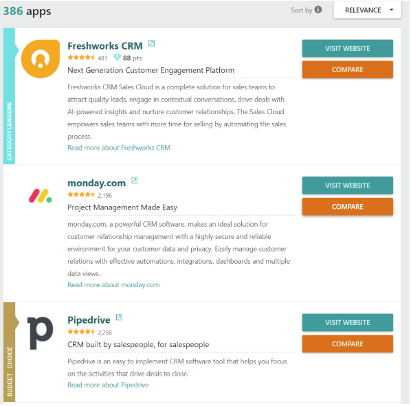
3 findingsTrust badges missed their mark, the results list hierarchy was unclear, and low-contrast calls to action caused confusion.
03 · Deliverable
Evidence-based recommendations
Editable navigation for logged-in users, a new badge category to separate paid clients and trusted external sources, more tooltips and microinteractions, and a refined color hierarchy for results.